Negative Space in Interior Design
Interior Design is a very complex thing. (Sometimes I wish it wasn't). Well, these days I am paying particular attention to negative space.
Interior Design is a very complex thing. (Sometimes I wish it wasn't). Well, these days I am paying particular attention to negative space. Mostly, I am looking at walls and noticing what people do with them. Some like to cover each and every square inch with something. Some (me included) like to have their walls more or less bare. I like mostly bare walls because I believe walls need room to breathe. In my opinion, when there is too much stuff on the walls, we tend not to notice the details at all. That is not to say that I am opposed wall galleries - no, no, no. What I am saying is that there should be balance: if you create a wall gallery - let it be just ONE wall. Not every wall in a room.
Negative space is like a pause in music. Though it is a pause, it is still music.
Here are a few examples:
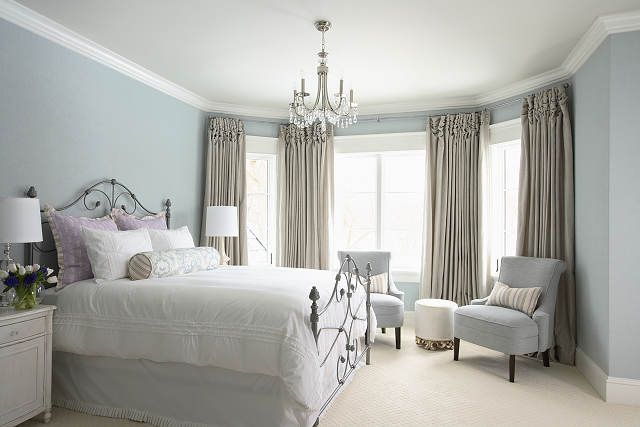
1. I love this bedroom for its quietness. Not only the soothing colors, but bare walls as well create a calming and relaxing atmosphere. Ahhh…….
(Design by Martha O'Hara Interiors)
2. This entryway is another study in skillful use of negative space. Had there been something on the front wall, it would be too busy, too fussy. An empty wall gives us an opportunity to appreciate the beautiful lantern, as well as a set of pictures on the back wall.
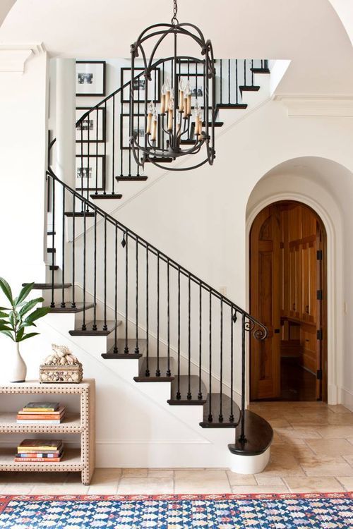
(Design by Phoebe Howard)
3. The designer could have put pictures on both sides of the window. Leaving those spaces empty, however, makes this small bathroom feel more spacious and calm.
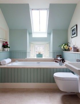
(Design by Robertson Lindsay)